Interfaces that make complicated work feel obvious.
Adoption is a design problem. We research how your people and customers actually behave, design flows that fit that behaviour, and leave you a design system your engineers can build against for years.
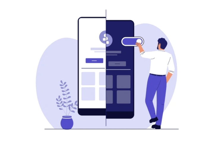
Design is the shortest path to adoption.
Enterprise software rarely fails because a feature is missing. It fails because the first five minutes are confusing, the flow contradicts how the team already works, or the interface asks people to hold too much in their head. Every one of those is cheap to fix before build and expensive after.
We design from evidence — interviews, task observation, analytics, and the operational map — then test the flow as a clickable prototype with the people who will actually use it, early enough that changing it costs a day rather than a quarter.
The end state is not a pile of screens. It is a design system: tokens, components, states, and rules that make every future screen consistent and cheap to build.
From behaviour to shipped interface.
Research
Interviews, task observation, and analytics review. We come out with the jobs to be done, the real constraints, and the moments where people give up.
Architecture and flows
Information architecture, navigation model, and every critical flow mapped end to end — agreed before anything gets styled.
Design the system, not the screen
Type scale, colour, spacing, and a component library with every state defined. Screens are then assembled from it.
Prototype and test
Clickable prototypes tested with real users, round after round. We report what broke and exactly what we changed.
Handoff and build support
Specs, tokens, and assets your engineers implement directly — plus design review during the build so quality survives contact with code.
A design foundation that outlives the project.
Research findings
A concise account of how your users behave, where they struggle, and which fixes carry the most weight — with the raw evidence attached.
Hi-fi interface design
Every critical screen designed for desktop and mobile, including empty, loading, error, and permission states.
Design system
Tokens, components, patterns and usage rules, documented and handed over in the tools your team already uses.
Accessibility baseline
Contrast, focus order, keyboard paths and semantics checked against WCAG 2.2 AA, with fixes specified.
Let's scope the work together.
Book a call with our team. We'll pressure-test the brief and come back with a plan, a timeline, and a number.